Three papers have done more to define the global light pollution debate than anything else published in the field. Falchi et al. (2016, Science Advances) mapped artificial sky brightness worldwide — 83% of the global population and 60% of Europeans under skies too bright to see the Milky Way. Kyba et al. (2017, Science Advances) measured lit surface area growing at +2.2% per year and radiance at +1.8% per year using VIIRS satellite data. Kyba et al. (2023, Science) found sky brightness increasing at +9.6% per year through citizen-science stellar observations. The three numbers measure different things by different methods — and they are routinely cited interchangeably, which produces errors that propagate into policy documents, journalism, and public debate. This article separates them. For the broader framework of measurement methods and instruments, see our article on measuring light pollution: methods, data, and research tools.
Falchi 2016 — The World Atlas of Artificial Night Sky Brightness
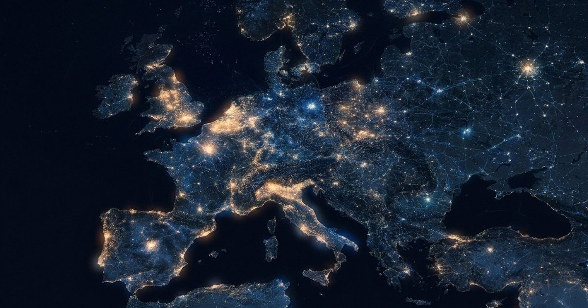
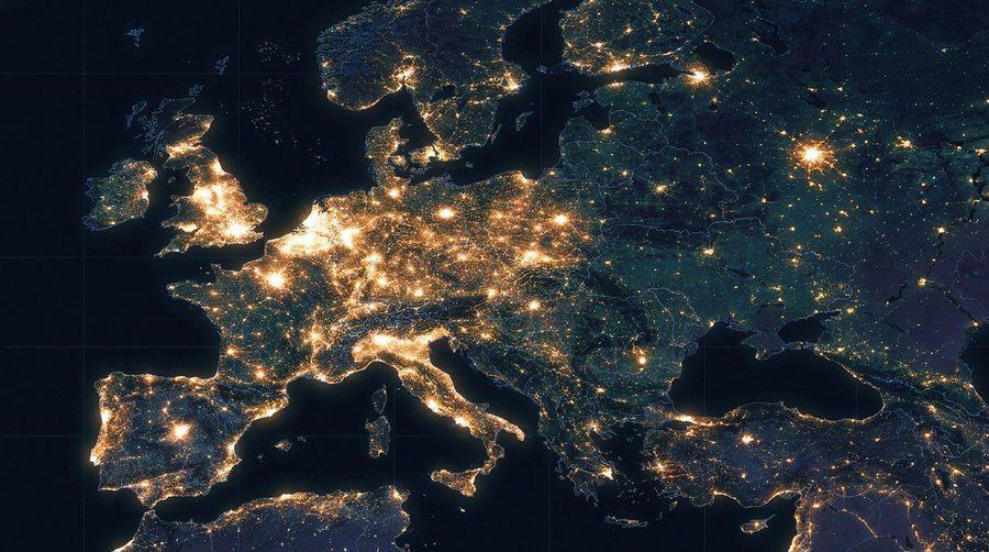
Falchi et al. mapped artificial sky brightness at ground level for the entire planet — and found the situation considerably worse than previous estimates had suggested.
The paper — Falchi, Cinzano, Duriscoe, Kyba, Elvidge, Baugh, Portnov, Rybnikova, and Furgoni, published in Science Advances on 10 June 2016 (DOI: 10.1126/sciadv.1600377) — is not simply a satellite light map. It is a radiative transfer model output. VIIRS DNB radiance data from Suomi-NPP provided the raw satellite input, but satellite sensors measure upwelling light above the atmosphere. To translate that into what an observer standing on the ground actually sees in the night sky, the team ran an atmospheric radiative transfer model: calculating how emitted light scatters through the full atmospheric column, accounting for aerosols, Rayleigh scattering, and multiple-scattering geometry across different elevation angles. The modelled sky brightness outputs were then calibrated against more than 35,000 ground-based Sky Quality Meter measurements contributed by observers worldwide — the most extensive empirical calibration dataset ever assembled for this purpose.
The headline results: 83% of the world’s population lives under light-polluted skies by any measurable definition. Ninety-nine percent of Americans and Europeans live under sky conditions that exceed the IDA threshold for light-polluted sky. Sixty percent of Europeans and eighty percent of Americans cannot see the Milky Way from their home location. At the darkest end of the scale, fewer than one in fifty Europeans has direct access to a genuinely pristine night sky from their residence. The full atlas data remains publicly accessible at lightpollutionmap.info, which integrates the Falchi 2016 layers as one of its primary datasets.
One number that circulates incorrectly: “90% of the world’s population under light-polluted skies” is not documented in Falchi 2016. The paper’s figure is 83% globally. The 99% figure applies specifically to the USA and EU populations — a different metric. Citation hygiene matters here, because the difference between 83% and 90% affects how amplification is communicated in policy contexts. For the connection between Milky Way loss and its psychological dimension, see our article on noctalgia: the language of losing the night sky and dark sky places in Europe.
Kyba 2017 — What the +2.2% Actually Measures
The most-cited number in light pollution coverage is the Kyba 2017 +2.2% figure. It measures lit surface area, not sky brightness — a distinction almost every secondary source fails to make.
Kyba, Kuester, Sanchez de Miguel, Gall, Dannemann, Guanter, Elvidge, Ziskin, Miller, Mann, Bharmal, Jechow, Holker, Kinzey, Hazak, Duriscoe, Rybnikova, and Furgoni published in Science Advances on 22 November 2017 (DOI: 10.1126/sciadv.1701528), using VIIRS DNB multi-annual data from 2012 to 2016. The paper measured two separate metrics.
The first metric: lit surface area. Earth’s total illuminated footprint — roads, parking areas, industrial zones, peri-urban expansion, formerly unlit areas brought into the lit network — grew at 2.2% per year across the measurement period. This is a spatial expansion metric. More of the Earth’s surface is illuminated than it was four years prior.
The second metric: radiance. In areas already lit at the start of the study period, total upwelling radiance grew at 1.8% per year. This reflects existing lit areas becoming brighter — either more fixtures, higher-output sources, or both.
Neither metric is sky brightness as an observer experiences it. Both are VIIRS measurements, which means both carry the satellite’s spectral limitation. The paper identified regional divergence: South America and Asia drove most growth; Europe appeared stable or slightly declining in VIIRS radiance across the measurement period. That European stability reading would become a central puzzle when the 2023 citizen-science data arrived and showed the opposite trend on the ground. For the instrument cross-calibration context that connects to these measurement challenges, see our article on the LoNNe intercomparison campaigns.
Kyba 2023 — The +9.6% Citizen Measurement
A completely independent measurement method, using human observers instead of satellites, found sky brightness growing nearly five times faster than VIIRS suggested. The paper appeared in January 2023, not 2022.
Kyba, Möller, Hölker, Eljarrat, Martínez-Míngaez, Sanchez de Miguel, Dobler, Fabio, Falchi, Duriscoe, and others published in Science 379: 265–268 on 19 January 2023 (DOI: 10.1126/science.abq7781). The dataset: 51,351 stellar visibility observations from 19,262 locations contributed by Globe at Night participants between 2011 and 2022. The method: observers compare the naked-eye sky against printed magnitude-limit charts for target constellations, producing a naked-eye limiting magnitude (NELM) estimate submitted via smartphone with GPS coordinates.
The finding: stellar visibility declined at a rate equivalent to sky brightness increasing by 9.6% per year across the 11-year dataset. Sky brightness doubles every approximately 7.5 years at this rate. That is not a marginal discrepancy with the satellite data. It is a categorical difference in the story being told about light pollution trends.
The Europe-specific result made the gap starker. VIIRS satellite data over the same period showed European sky radiance essentially flat or slightly declining. The Globe at Night citizen data showed European sky brightness increasing at approximately 6.5% per year. Same geography. Partially overlapping time period. Opposite apparent trend direction. The divergence is not noise. It is the LED blindspot in quantitative form — which the following section explains. For those wanting to contribute to the citizen science network that produced this dataset, see our Globe at Night citizen science tutorial.
Why the Numbers Disagree — The VIIRS Blind Spot
VIIRS DNB cannot see the blue wavelengths that LED street lights emit. Every city that switched from sodium to LED lamps got darker on satellite maps while getting brighter to human eyes.
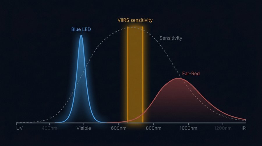
VIIRS DNB — Day/Night Band — is the primary imaging sensor aboard Suomi-NPP (launched October 2011) and NOAA-20 / JPSS-1 (launched November 2017). Its spectral passband runs from 505 to 890 nm. That lower boundary at 505 nm is an engineering consequence: suppressing solar scatter at shorter wavelengths to allow useful night-time imaging. The instrument was designed and calibrated in an era when high-pressure sodium (HPS) lamps dominated street lighting. HPS emission peaks at approximately 589 nm — comfortably inside the VIIRS window.
White LED street lamps are built differently. A blue LED pump chip emits at approximately 440–480 nm; that light excites a broad-spectrum phosphor layer that converts it to the full visible spectrum. The resulting output includes a pronounced blue peak centred below 500 nm. This peak — the dominant spectral signature of every LED-retrofitted street in Europe — falls entirely below the VIIRS 505 nm lower boundary. The satellite cannot detect it.
Three compounding mechanisms amplify the problem beyond simple spectral blindness. First, blue light scatters more efficiently in the atmosphere via Rayleigh scattering, which follows a λ⁻⁴ wavelength dependence. A photon at 450 nm scatters approximately three times more strongly per unit path length than a photon at 590 nm. LED blue emission contributes disproportionately to sky glow relative to its total energy output, compared to an equivalent sodium source. Second, much urban LED emission is directed horizontally: façade illumination, advertising displays, upward-tilted fixtures. These sources are not detectable by a nadir-viewing satellite but scatter directly into the sky hemisphere visible to an observer on the ground. Third, the atmospheric column above a city refracts and scatters LED blue emission more broadly than longer-wavelength sodium light, extending the sky glow footprint spatially. Hänel et al. (2018, Journal of Quantitative Spectroscopy and Radiative Transfer, 205: 278–290; arXiv:1709.09558) quantified this instrument mismatch using calibrated fisheye cameras with separated colour channels at the same sites where SQMs showed stable or declining readings. For a full explanation of how the SQM faces the same spectral limitation at ground level, see our SQM buyer’s guide and our article on skyglow: causes, reach, and why it stretches 200 km.
How to Use These Numbers Correctly
Each paper answers a specific question. Substituting one number for another produces a factually wrong claim.
Falchi 2016 answers: what fraction of the global and regional population lives under measurably light-polluted sky conditions, and where are the brightest and darkest locations? Use it for baseline statistics, Milky Way visibility loss, and geographic comparisons. The 83% global and 60% European Milky Way figures come from here.
Kyba 2017 answers: at what rate is the Earth’s illuminated land area and upwelling radiance growing, as measured by satellite between 2012 and 2016? Use it for land-use-change discussions, infrastructure growth, and VIIRS-detectable radiance trends. The +2.2% and +1.8% figures come from here — they measure area and radiance, not sky brightness.
Kyba 2023 answers: at what rate is stellar visibility declining as experienced by human observers and recorded via citizen science across 2011–2022? Use it for sky brightness trends as perceived by observers, as captured by an instrument — the human eye — with no spectral blind spot in the blue. The +9.6% figure comes from here.
Three errors appear with high frequency in secondary coverage. “Kyba +2.2% brightness” is wrong: Kyba 2017 measured lit area and radiance, not sky brightness as seen from the ground. “Kyba 2022” is wrong: the stellar visibility paper was published in January 2023. “Falchi 90%” is wrong: the paper documents 83% globally; the 99% figure applies specifically to American and European populations.
A note on scientific journalism: this is not pedantry. When a policy document cites “Kyba +2.2% sky brightness growth”, it is citing a number that does not exist. When legislation is built on that misreading, the mismatch between what the satellite measures and what LED deployment actually does to night sky quality is embedded into the policy framework from the start. The numbers matter because the remediation they justify matters. For the methodology standards that LoNNe established precisely to prevent this kind of measurement conflation, see our article on the LoNNe intercomparison campaigns: what four field tests revealed.
The Limitations Nobody Mentions
All three papers have methodological constraints that their primary authors document but that secondary coverage consistently omits.
Falchi 2016 and Kyba 2017 both use VIIRS DNB as their primary input. Both therefore carry the same LED-blindspot limitation. The Falchi atlas is a radiative transfer model output calibrated to ground truth — but that ground truth used SQMs, which also underreport blue-LED contributions. The calibration point cloud includes pre-LED-transition measurements from observers in areas that have since been retrofitted, meaning the atlas may be increasingly misaligned with current ground conditions in LED-heavy urban Europe. The 35,000 calibration measurements are a strength; their temporal distribution across the LED transition period is a complication.
Kyba 2023 is citizen-based, which introduces its own constraints. Observer bias is real: observers who choose to participate in Globe at Night are not a random sample of the global population. They are disproportionately astronomy-aware, meaning they may be more likely to be located at darker sites, or more likely to submit observations when conditions are favourable. Cloud contamination, despite protocol guidance, affects NELM estimates. Seasonal sampling varies by campaign, and different target constellations are only visible in specific seasons, creating temporal sampling gaps. Kyba et al. discuss these limitations in the paper — but the 9.6% figure circulates without the caveat.
Where all three converge: qualitatively, the conclusion is the same. Light pollution is increasing. The rate depends on what you measure and how. The LED transition has made the problem worse than instruments designed for the sodium era can detect. Next-generation satellite instruments — including JPSS-2 (launched November 2022) and Meteosat Third Generation operational instruments expected to provide enhanced night-time imaging from approximately 2025 onwards — carry improved spectral characterisation that may narrow the gap between what satellites measure and what observers on the ground experience. The field is watching those datasets.
Frequently Asked Questions
What does Falchi 2016 actually measure?
Falchi et al. 2016 measures artificial sky brightness at ground level — the brightness of the night sky above an observer’s head attributable to artificial light sources. It uses VIIRS DNB satellite radiance as input to an atmospheric radiative transfer model, which translates upwelling light detected from orbit into what a human observer would see in the sky. The outputs were calibrated against more than 35,000 ground SQM measurements. The result is a global map of artificial sky brightness expressed in mag/arcsec² and as a ratio to the natural sky background.
Is Kyba 2017 or Kyba 2023 the definitive number?
Neither — they measure different quantities and are both valid for their specific questions. Kyba 2017 is the definitive source for satellite-detected changes in lit surface area and radiance between 2012 and 2016. Kyba 2023 is the definitive source for citizen-observed stellar visibility trends across 2011–2022. If you want to describe how the sky is changing as a human observer experiences it, Kyba 2023 is more directly relevant. If you want to describe infrastructure growth in illuminated land area, Kyba 2017 is the correct citation. They are not competing estimates of the same quantity.
Why do satellite data and citizen data disagree on Europe?
VIIRS DNB detects light in the 505–890 nm spectral band. Modern white LED street lights emit a substantial fraction of their output below 505 nm — in the blue range centred around 440–480 nm. Every European city that switched from high-pressure sodium to LED lamps reduced its VIIRS-detectable radiance while increasing the blue-wavelength emission that reaches human observers. The satellite sees less; the eye sees more. Kyba et al. 2023 quantified this as approximately a 6.5% per year increase in European sky brightness by citizen observation over a period when VIIRS showed near-zero change. The LED blindspot is the mechanism. It is not instrument error — it is an instrument-era mismatch with a technology transition.
Where can I find the World Atlas for my location?
The Falchi 2016 atlas data is publicly accessible via lightpollutionmap.info, which displays the atlas brightness layers over an interactive map. The underlying dataset was released under Creative Commons licence alongside the paper. You can find your location, toggle the atlas layer, and read off the artificial sky brightness value as a fraction of the natural sky background. Values below 0.01 (less than 1% artificial contribution) indicate essentially pristine conditions; values above 1.0 mean artificial sky brightness exceeds the natural background. For most European locations outside designated dark sky areas, values range from 0.3 to above 3.0.